An experienced webmaster conducts an extensive analysis before launching an ad campaign. He/she studies every detail which may affect future conversions: GEO, offer, target audience with its pains and needs, creatives, triggers, language, etc. Also, based on the data collected, he/she considers what must be avoided in the ad campaign, so that it won’t go down the drain.
Regarding our recent TG post about Turkey, we decided to analyze one of the landing pages in the weight loss niche. Step by step, we’ll go through the pros and cons of creative-making and determine milestones that will affect your profit.
Offer: 19528 Harmonica – COD – [TR] from $6.00
Landing Page: 25214
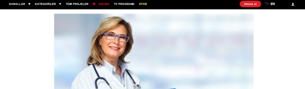
By following the link, you’ll be redirected to the landing one-pager with the offer. There’s the menu bar, the option to select the language, and the action button.
😎 Let’s Start with the Pros:
Ad copy
- The landing page is in Turkish, which a user will have no trouble perceiving = automatically increases confidence in the product.
- The title indicates the “pain” of the target audience with several health problems mentioned that catch the reader’s attention at once:
There are statistics provided, suggesting to the user that he is not alone and his problem is relevant to many others, which means that the necessary research is being conducted and there are certain solutions to that.
- Q&A is one of the most adopted formats. There is a particular specialist, a doctor, who begins his story with a quote, so the user enters into a dialogue with a pro. Photos win over the customer because as you know, images increase the visual interest and the adoption of the given material.
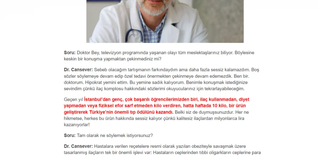

There are several specialists in this case, which emphasizes the importance of the issue and doctors’ engagement in finding the solution.
- Product presentation and comments on the landing page include objection handling (answers to customers’ forthcoming questions).
- There is a working solution with its benefits, people’s stories, and results.
- The offer is limited in time and supply, which motivates the customer to make a purchase.
Content
- A simple clean design with no unnecessary links, pictures, or symbols increases the reader’s engagement, holding his/her attention on the product.
- Three main colors and one additional one are used to focus the customer’s attention on key points).
- Doctor photos are of high quality. People are pictured smiling, winning the reader over from the very start. There’s medical paraphernalia and equipment pictured as well, which also affects customer confidence.
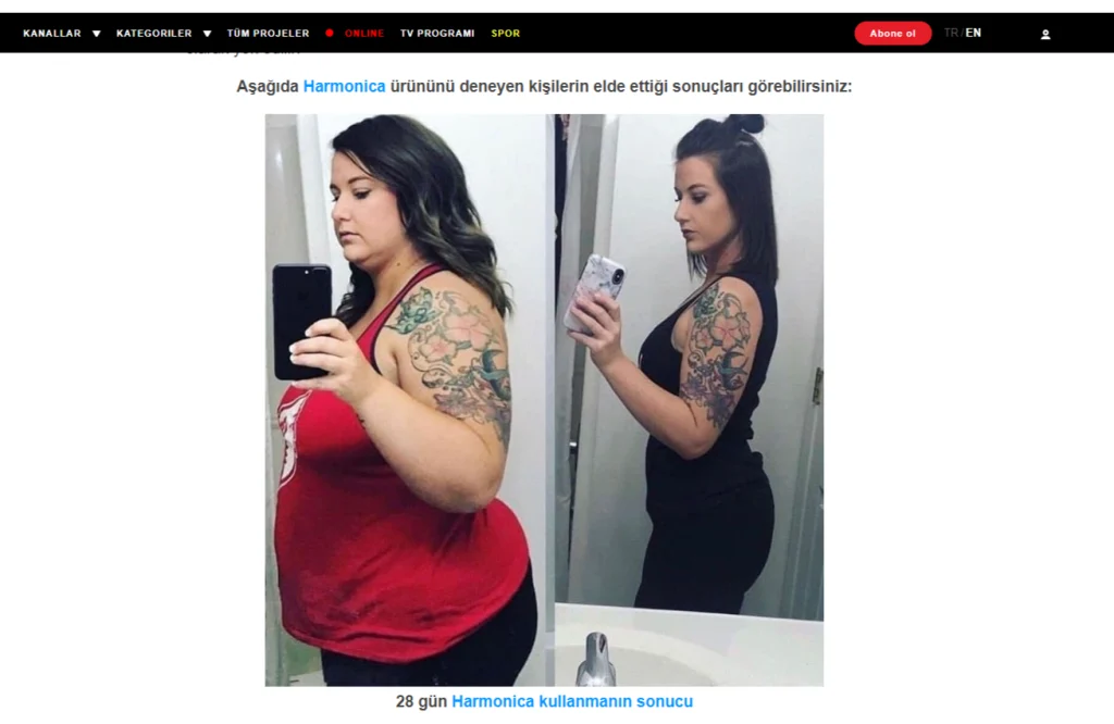
- There are photos of customers who have tried out the product and shared their results. There are a lot of “Before & After” photos attached to the stories of people who have already purchased the product. Please note that the customers are pictured smiling, they are happy with the purchase and the outcome, which may be an additional motivation for a would-be customer to make a purchase.
- When a customer purchases online, it is important for him/her to see a photo of the product so that he/she can assess its quality, dimensions, and packaging. People are looking for real photos of other buyers to make sure that the product is genuine.
😳 Cons:
Ad copy
- No product findings included. Figures, data, statistics, and extracts from scientific studies raise customer confidence. After all, he/she may follow the hypothetical process of product development, relying on scientific findings confirmed by paramedics and doctors.
- Local mentions won’t be enough (local TV shows, celebrities, state agencies). A global analysis of the problem, a massive emphasis, and the universal solution which is all over the news are better. You would buy it too, admit it)
- There’s no logical conclusion in the interview. You can logically proceed to customer reviews or the product presentation to anticipate customer questions and expectations.
Content
- There is no integral style of photos in the article. Sometimes it’s even better since real-life photos of people and their results do not require additional processing, but they may affect the overall visual of the landing page.
- Depending on the context here, a simple order form would be more consistent than the sweepstakes.
- There are too many residents of foreign countries in photos in the article and comments section. To create a look of harmony, you might want to thoroughly consider the visual racial characteristics of the residents of the region you’re advertising in so that the customer knows that the product works for his/her climate and race. Besides, people tend to trust their people more)
So it goes. Hereby, we have analyzed the landing page in a nutra sub-vertical, considering regional specifics and the needs of the target audience. Do not hesitate to experiment, conduct tests, and apply out-of-the-box solutions: you never know what provides a greater response and leads that will be approved.
With love, your dr.cash!